Company
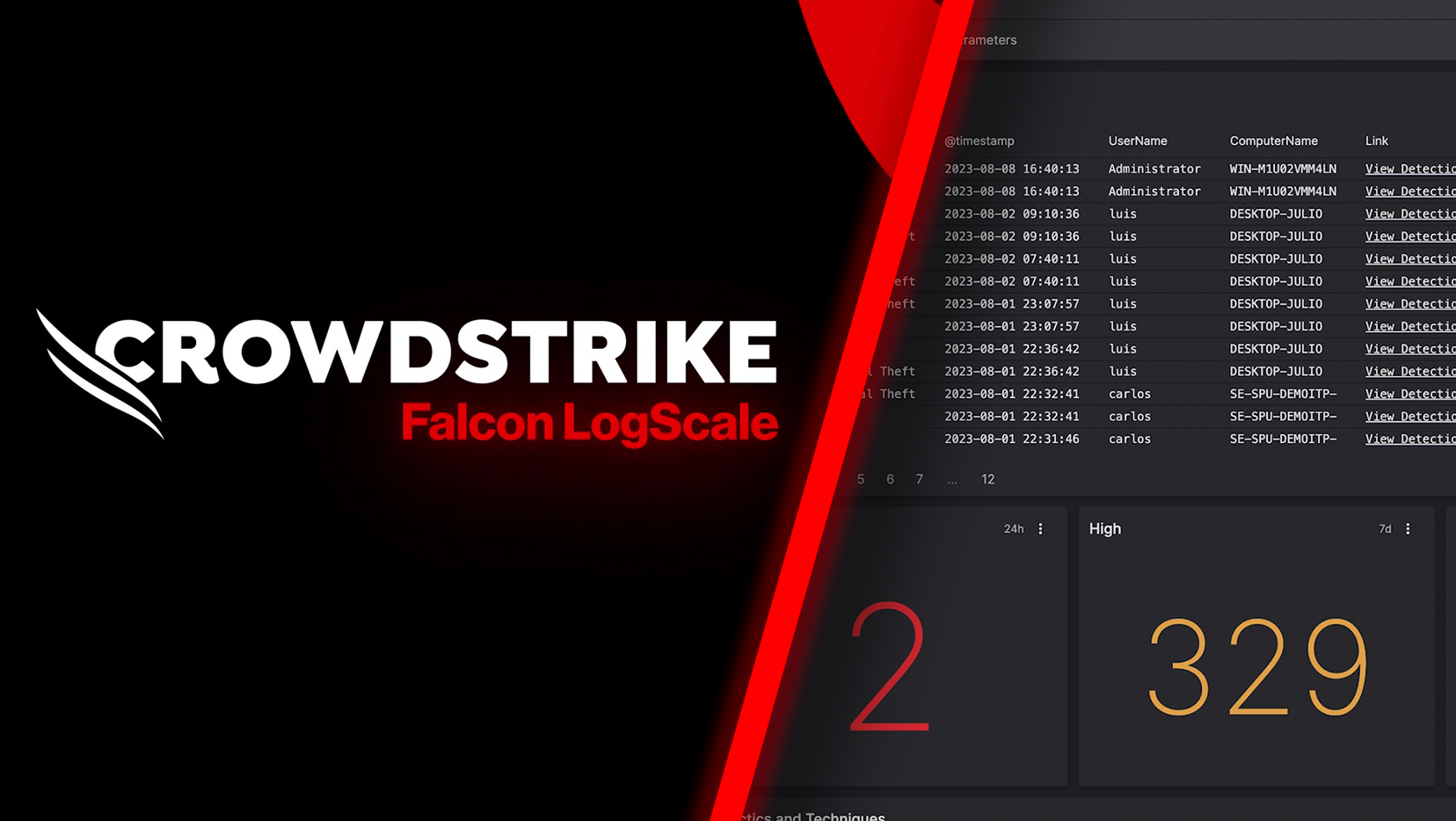
Crowdstrike / Falcon Logscale
What was delivered
Visual identity
Product design
Design operations
Design system
Concept development
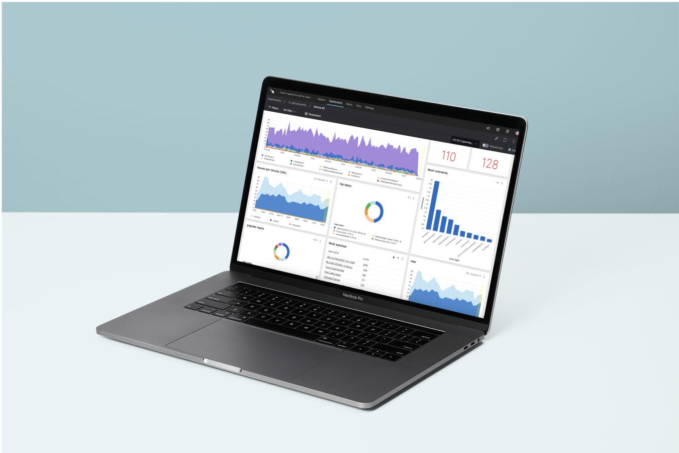
Falcon Logscale (formerly Humio) is a log management and observability platform designed to handle and analyze large amounts of log data in real time, providing organizations with insights into their systems and applications.
The product's unique architecture enables fast and efficient log processing, making it well-suited for applications where real-time data analysis is crucial. It offers flexible search capabilities, live tailing of logs, and the ability to create custom dashboards for monitoring and visualization.
___
*Much my work with this company is confidential as not all features or systems are open to the public. For this reason, I am limited in the examples I can show.

My role
I was the first designer at Logscale back when it was just a startup known as Humio. Over my 4 years there I worked on new features starting with the permission model, filtering for the search page, and controls for creating visualizations. I also headed the effort to transform the look and feel of the original product and created a design system that included a consistent structure that made for easier communication between design and code using Tailwind CSS framework. After Humio rebranded, I worked on changing our product and system to match the Falcon product.
Theming
From the very start of working with the product, we had many requests for dark mode from customers. for this reason, we considered easy ways to swap between themes when building a color system.
I built a large principle pallet at the same time as researching color usage for data visualization and code syntax as well as running UI tests on the side using different monitor settings and checking for color contrasts that meet accessibility requirements.
After the palettes were created I continued running UI tests along with designers in other product groups while coming up with default styles for text, borders, backgrounds, and more. These styles were then consolidated together to be used for area styles that created default presets for everything contained in the area section. These styles could be overridden as necessary, but any changes to the areas would change across the site.
This setup made it incredibly fast for the other teams to build features in both light and dark modes as they did not have to think about each individual color every time they designed and developed new features. We also were short on designers so it helped empower our developers to make the right choices without having to check with us.
The areas in ELM also made it possible to configure settings for components within an area, so if we wanted default buttons, fields, or other common components, the styling would be the same for the area unless specified otherwise.

Integrating into a new product
Initially, Logscale (Humio at the time) ran as its own product but with the introduction of our search into XDR, we quickly had to make our search and dashboard page fit into the bigger product. Crowdstrike's design system was built on a simple color system that didn't have a principal palette to match. Each color was hand-selected for specific uses so it was a challenge to match colors.
We started by shifting our principal colors to be close to the same hue as their most common colors. this made it possible to make sweeping changes across the page.
We had a bigger challenge when it was announced that we would rebrand and become a Falcon product. To save time, we created a small transitional system that could reference theirs but work with our different framework that needed to support more color options as the data visualizations were more complex and had different user base that preferred something easier on the eye.
Towards the end of my time at Logscale, I was in the process of documenting the changes between the old system, the new one, and Crowdstrike's existing system.

